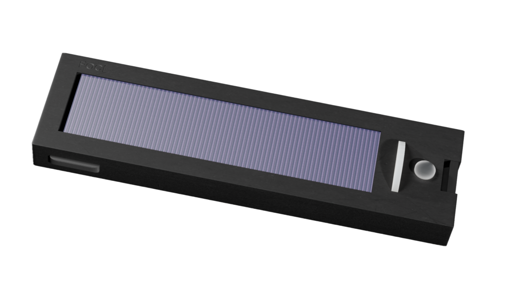
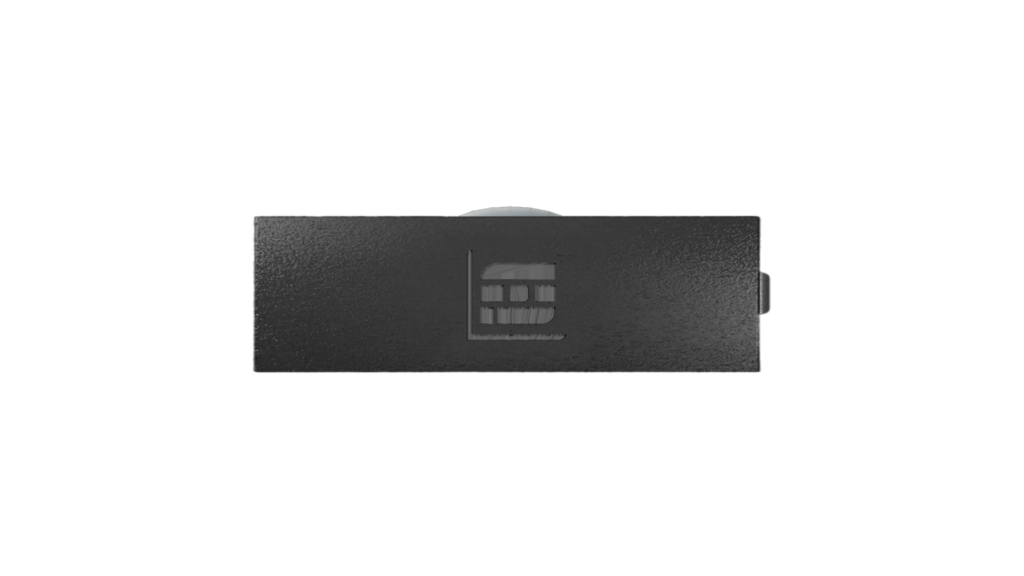
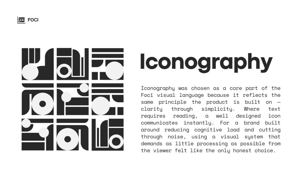
The Brief
Define and build a brand from the ground up.
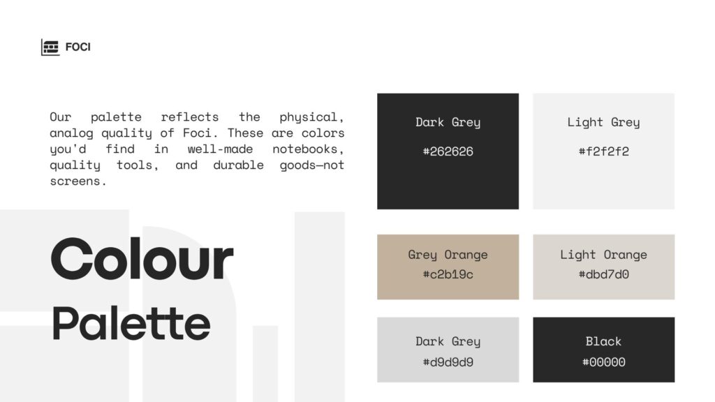
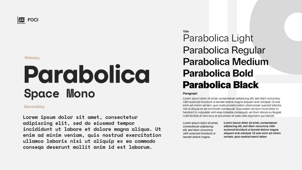
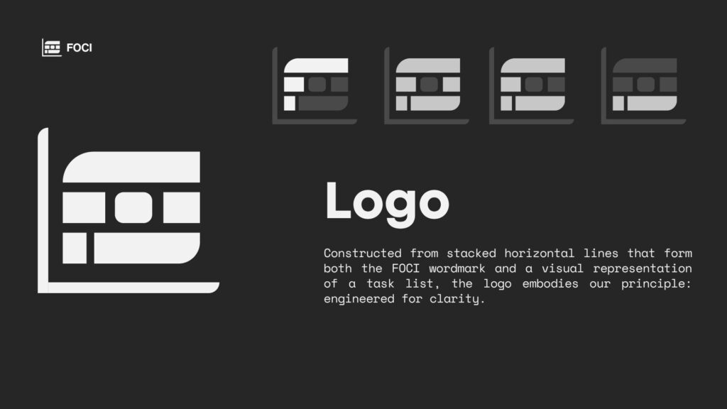
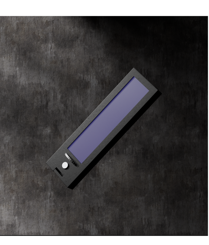
Name the product, establish the visual language, apply it consistently across print, digital and motion graphics and visualise the physical product in 3D.
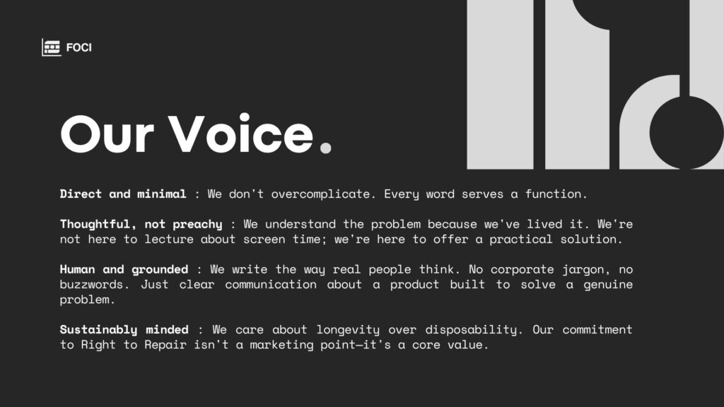
The brand had to feel premium, minimal and intentional credible enough to sit alongside established consumer technology brands.